Our film poster challenges conventions in terms of it being black & white. Almost all of the film posters we have looked at including The Dark Knight and Indiana Jones, have included some form of bright colour such as blue or red to catch the viewers eye, however we decided that our black and white poster is effective for the mystery type thriller film our teaser trailer advertises. Some posters we did find that were black and white included Eagle Eye and I'm Not There, but even these had some kind of coloured writing. Our poster followed the conventions of other real film posters in terms of the writing that is included. Most film posters including Eagle Eye, include details of the director, producer etc and also have a tag line which we include. An example of this is the tag line "Why so serious?" on the batman posters. Also to make the poster look authentic I have included small logos such as Warner Brothers and Dolby Digital, like most posters do.
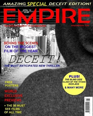
Our film magazine front cover follows the conventions of film magazine Empire. By researching real Empire front covers we found a similar font and included the same colours. To make it look more realistic we included a barcode, price, date and website address. We also included Empires trademark "the world's biggest movie magazine" underneath the heading. We used lanuage that Empire uses such as "free, exclusive, special, amazing, behind-the-scenes and previews".
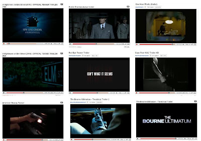
 In Frame 1 above, we used the Warner Bros logo to make our teaser trailer look more realistic as all teaser trailers have been made by a company. This is shown in Frame 1 below so we followed conventions. In Frame 2 above, the costumes we used were casual and representative of what normal teenage girls would wear. In Frame 2 below, by wearing smart clothing such as a suit, tie and hat it gives the impression that they are important business men. We have also followed conventions here as the female characters are dressed in casual clothing and the 'baddie' male character is dressed in plain, black clothing to show this. In Frame 3 above, we used an over the shoulder shot of the male character watching the house. In Frame 3 below, there is a shot of somebody watching a family inside their house filming them. While we have included an over the shoulder shot to show that there is somebody in the story watching the house, they have used an actual camera shot that somebody has taken to show that the character in the story is watching them, not just the audience. So, while we have used a similiar idea of a character in the story watching somebody else, we have developed this by including the shoulder and head of the character in the shot. In Frame 4 above, we used a prop which was a threatening note and is a main part in the plot as he is stalking her. In Frame 4 below, the sign says Elm Street which relates to the title of the film so is an important prop used to inform the audience. This challenges conventions as our props are completely different and threats are more likely to be heard on a phonecall than written down. In Frame 5 above, we put in a title 'Isn't who they said they were' and in Frame 5 below there is a title 'Isn't what it seems', our titles followed conventions as they are often used in trailers to both inform and engage the audience. In Frame 6 above, there is a close-up on a hand opening the door and in Frame 6 below, there is also a close-up on the hand opening the door. We have followed conventions as by using a close-up this informs the audience that this is an important part in the storyline. Because it is something as simple as somebody opening a door, it gives the impression that the person opening the door is going to affect the storyline in some way, good or bad. In Frame 7 above, we used a close-up shot of a knife dripping with blood and in Frame 7 below, there is a close-up on a hand bringing out a gun. We have used typical conventions of the stalker/thriller type genre by including a weapon and by including blood on the knife, the audience will assume that somebody has been injured or killed. In Frame 8 above, a shot of a text message saying 'I'm worried about you, please listen to me. I haven't seen you in weeks!', which informs the audience and engages them in the storyline. In Frame 8 below, a mobile phone is also used which is fairly common in film's of today as they are used in everyday life to stay in contact with people. In Frame 9 above, for the title of our film 'Deceit' we used a simple block white font on a black background to make it stand out, similiar to the title used in 'The Bourne Ultimatum'.


 Another way in which i think the combination of the main product and ancillary texts is effective is because they all create the same atmosphere of enigma code (which is used a lot in the thriller genre) to appeal to our target audience of thriller/mystery fans. The teaser trailer throughout creates this enigma with the knife dripping blood, the threating note, the worried phone message and the hooded figure. This relates to Todorov's theory of equilibrium, because in our teaser trailer we do not see the 5 stages of equilibrium (we only see disruption of equilibrium), it makes the audience want to see the film to see how the situation is resolved. The film poster creates enigma but in a different way. The hooded figure creates this mystery as we do not know who it is, but also the sentences such as "be careful who you trust" and "coming to get you soon". The front cover also appeals to our target audience because it says "the most anticipated new thriller."
 We used Blogger to conduct our questionnaire in order to get feedback from our target audience about which elements they prefer in teaser trailers. This also helped us decide on our final idea and enabled us to include what our target audience wanted. Also, we used Blogger to present all our work and to help us organise our time well.


